Industry
Aviation
E-commerce
Tools
Figma
Miro
Google Meet
Pen & paper
Microsoft Word
Year
2025
Designing an online booking system
Affinity Mapping & Customer Journey
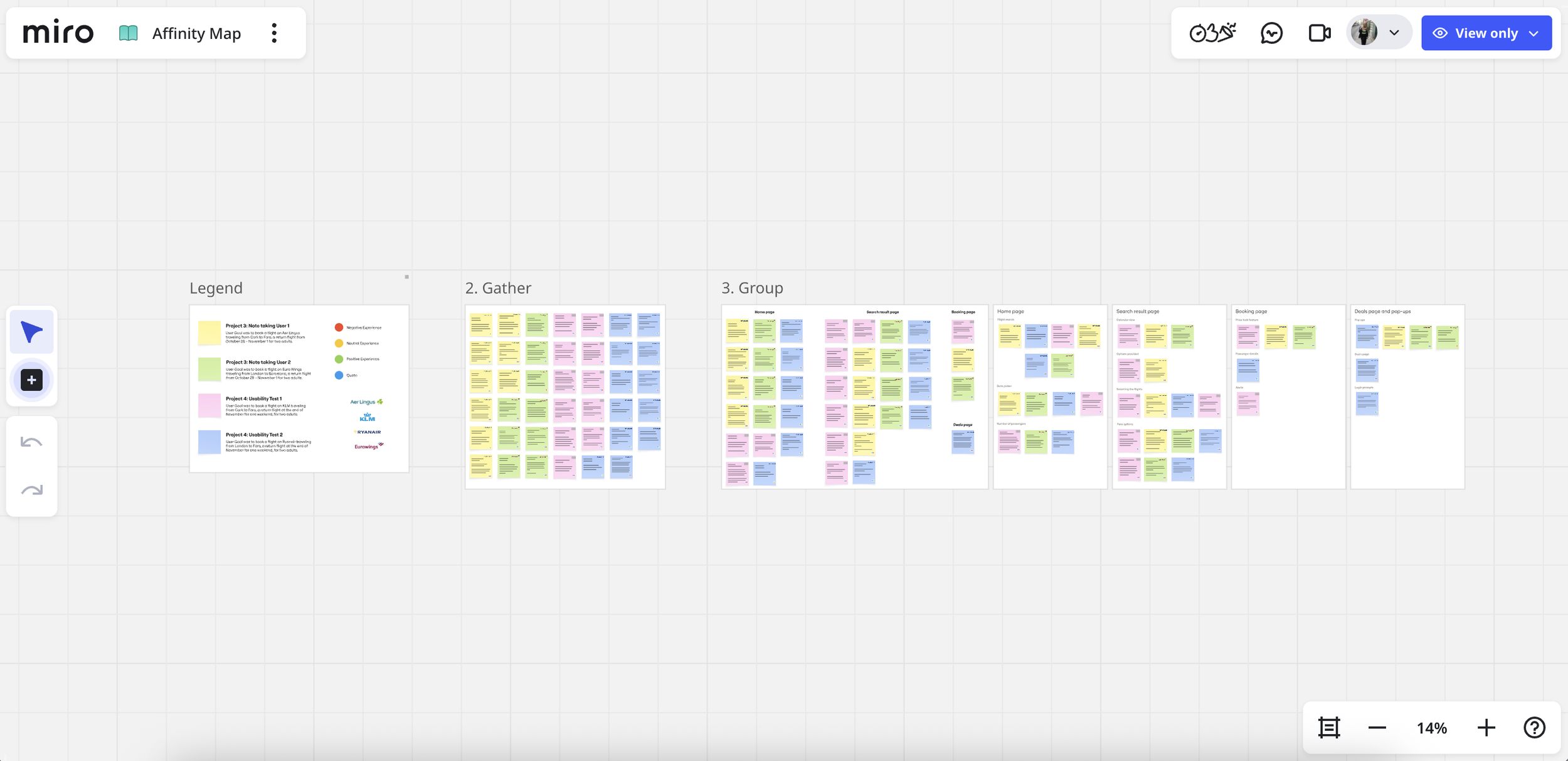
To make sense of the research, I created an affinity map that organized observations into themes. This helped uncover patterns in user behaviour and isolate core areas of frustration.
Following this, I built a Customer Journey Map to visualize the end-to-end experience. This highlighted specific moments of confusion and opportunity — especially where users needed reassurance or clearer feedback.
Flow Diagram & Early Sketching
With the core insights in hand, I mapped out the end-to-end booking journey, prioritising essential user tasks and minimising friction. Sketches allowed me to quickly explore layout ideas and interaction concepts before committing to digital designs.
This early stage kept me focused on solving real user problems rather than polishing visuals too soon.
Prototyping & Annotation
I translated the strongest concepts from my sketches into low-fidelity wireframes, focusing on structure, navigation, and content hierarchy. At this stage, the goal was to validate the logic of the flow rather than visual details.
I used annotations to clearly document:
Intended user actions
System feedback and edge cases
The rationale behind key UX decisions
These annotations helped clarify how the experience should function and made design decisions explicit, even without live user testing at this stage.
During my UX Design Professional Diploma, I designed an online booking system from the ground up - a web platform, no app - focused on creating a smooth and intuitive user experience. This project gave me the chance to apply a full range of UX skills and simplify a complex process for real users.
The Problem
Flight and travel booking experiences can be frustrating — users often encounter unclear navigation, confusing calls-to-action, and unnecessary steps that lead to hesitation or abandonment.
Users needed
Clear guidance through the booking flow
Logical navigation and simplified decisions
Confidence that they were completing tasks efficiently
The Goal
To identify and resolve common usability pain points and create a design that felt effortless, intuitive, and user-friendly — ultimately lowering barriers in the booking journey.

Usability Testing
I conducted usability tests where participants completed flight booking tasks on four different booking sites. I moderated one session and documented the others, focusing on observable behaviour rather than assumptions — ensuring insights were clear even without watching recordings.
Key findings:
Users struggled with unclear navigation and labelling
Calls-to-action lacked consistency, causing hesitation
Friction points often stemmed from unnecessary steps in the flow
These insights informed the rest of the design work.
Lift off ✈
Lift off ✈
Outcome & Reflection
Outcomes
This UX project strengthened my ability to:
Conduct purposeful usability research and synthesize findings into clear, actionable insights
Translate observed behavioural patterns into structured UX decisions and user flows
Design logical, end-to-end experiences informed by research and established UX principles
Create cohesive systems that support user goals while reducing friction in complex tasks
Reflection & Next Steps
If I were to continue developing this project, the next steps would include:
Expanding usability testing to include a broader and more diverse group of users
Comparing additional competitor booking flows to further validate interaction patterns
Applying progressive disclosure more intentionally in complex steps such as add-ons and payment
Testing and refining a high-fidelity prototype with real users to validate assumptions and identify friction points
This project highlighted the importance of grounding design decisions in research while reinforcing that real user validation is a critical next step in strengthening and refining the experience.