Industry
Fintech (Digital Banking)
Tools
Figma
Year
2025
Designing an Intuitive, Responsive UI for Everyday Banking
In this project, I designed the user interface for Nexus, a conceptual digital bank focused on balancing clarity, trust, and personality in financial experiences. While created as part of my UI coursework, the approach, decisions, and deliverables were crafted with real-world product standards in mind.
The Problem
Many financial products overwhelm users with dense data, inconsistent visual hierarchy, and interfaces that prioritise functionality over clarity. This often leads to confusion, reduced trust, and poor engagement — especially for users who don’t consider themselves financially confident.
The challenge was to design a financial interface that:
Presents complex information in a clear, scannable way
Builds trust through visual consistency and restraint
Still maintains a distinct, modern character
The Goal
The goal of Nexus was to create a UI system that balances clarity and personality — supporting users in understanding their finances without feeling intimidated or overloaded.
Key design objectives:
Reduce cognitive load when scanning financial data
Establish a strong visual hierarchy across screens
Create a reusable system that could scale across features
Target Users
Nexus is designed for digitally confident users who want visibility and control over their finances, but may feel overwhelmed by traditional banking dashboards.
Primary needs:
Quickly understand their financial status
Identify key actions without friction
Trust the product with sensitive information
Visual Exploration & Direction
I began by exploring visual references from fintech, editorial layouts, and data-driven products. The direction I chose combined:
Clean, structured layouts inspired by editorial design
A restrained colour palette to avoid visual noise
Subtle personality through typography and spacing
This balance helped reinforce trust while still giving the interface a distinctive character.
Grid & Layout System
A structured grid system was used to support consistency and readability across screens. Financial data is often scanned rather than read, so the grid was designed to:
Support quick comparison of values
Maintain alignment across different screen sizes
Create predictable patterns for repeated information
This structure became the foundation for all UI decisions that followed.
Components & UI Elements
I designed a flexible component library to ensure consistency across the product. Components were built to:
Be reusable across multiple screens
Handle different data states
Support future expansion of features
This system-based approach makes the interface easier to maintain and scale over time.
Typography
Typography plays a key role in establishing hierarchy and clarity. A combination of type styles was used to:
Clearly differentiate between primary values, labels, and supporting information
Improve scan-ability in data-dense views
Maintain a professional tone appropriate for a financial product
Careful use of weight and size ensured that important numbers stand out without overwhelming the interface.
Colour System
The colour palette was intentionally minimal to reduce cognitive load and keep the focus on the data. Colour is primarily used to:
Highlight key actions and states
Support hierarchy rather than decoration
Reinforce brand personality in a subtle way
This approach helps users quickly identify what matters most on each screen.
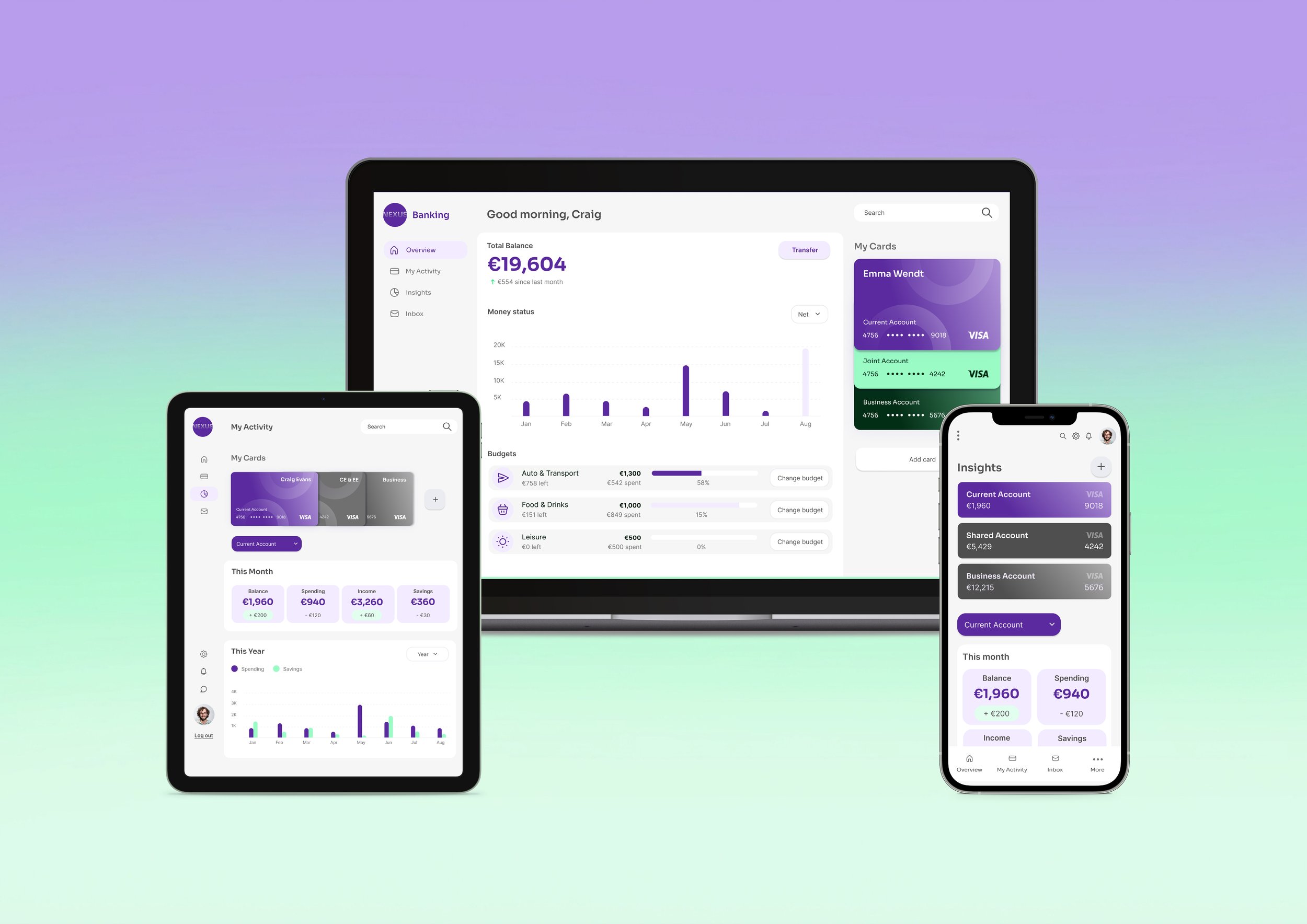
Key Screens
The final screens demonstrate how the visual system comes together in practice. Each screen prioritizes:
Clear hierarchy of information
Logical grouping of related data
Minimal distractions around core financial insights
The result is an interface that feels calm, structured, and easy to navigate — even when presenting complex information.
Outcome & Reflection
Outcomes:
Nexus resulted in a cohesive UI system that translates complex financial data into a clear, approachable experience. The project strengthened my ability to:
Design scalable UI systems
Balance aesthetics with usability
Make intentional design decisions for data-heavy products
Reflection & Next Steps
If I were to continue developing Nexus, I would:
Conduct usability testing to validate hierarchy and comprehension
Explore motion and micro-interactions for feedback and state changes
Expand the system to cover additional financial scenarios
This project reinforced the importance of clarity, restraint, and systems thinking in UI design.